Ecownomics
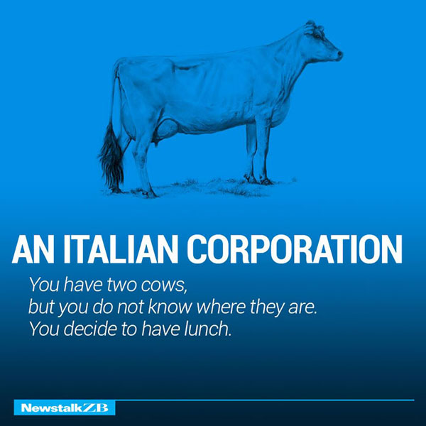
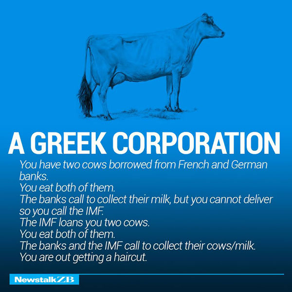
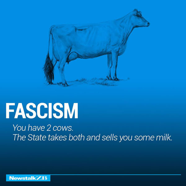
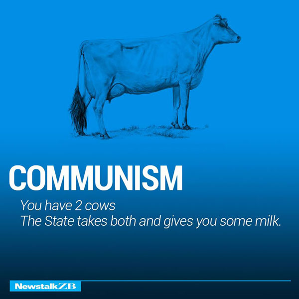
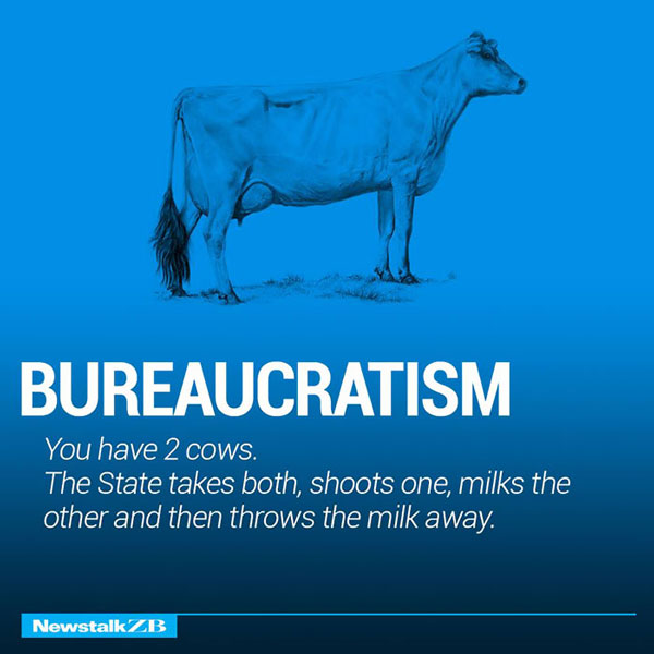
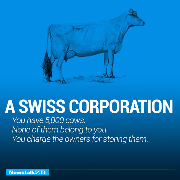
Very basically put economics describes the factors which determine the production, distribution and consumption of goods and economics; but have you heard about ecownomics? Well look no further teachers, professors and professionals; in a world ruled by the internet infographics and images are the easiest way to teach and explain the simplified version of very complex ideas. The following list from Newstalk, popularly known as Ecownomics, highlights the difference between various political and corporate systems. The images are very simple and yet have a grain of truth in them. It’s debatable though.
As kids we were always shown flash cards to remember the letters to the alphabet, this one seems like the modern, peppy version to remember how the economic system works in several countries. Ecownomics doesn’t boast of a huge, complicated theory with marginal utility curves across pages, it’s a simplified amalgamation of all of these. For students who are into world economics and wish to do an in depth study into the topic, this could be a good place to begin with.
It’s not just for people passionate about economics, even people who don’t understand the subject well, but wish to know more about it, ecownomics works wonders. It may not really be out there in the conventional sense, but it is profound. Every theory, no matter how complicated, has a core that it addresses. The entire write up is centred around that core which is the crust of the matter. These images on Ecownomics are exactly that. They don’t explain the theory, they focus on the core. Because as they say, if your core is clear, it doesn’t take ages to understand the theory.
All of these are our favourite, but we would like to know which one do you think is bang on! Have a look and decide.
1
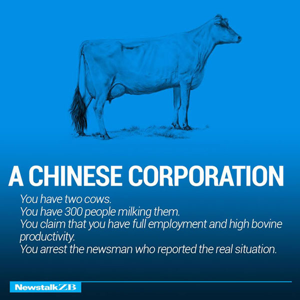
2
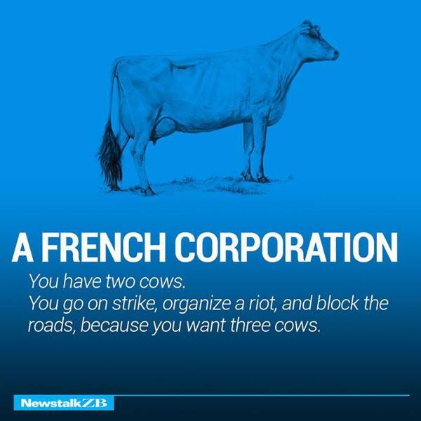
3
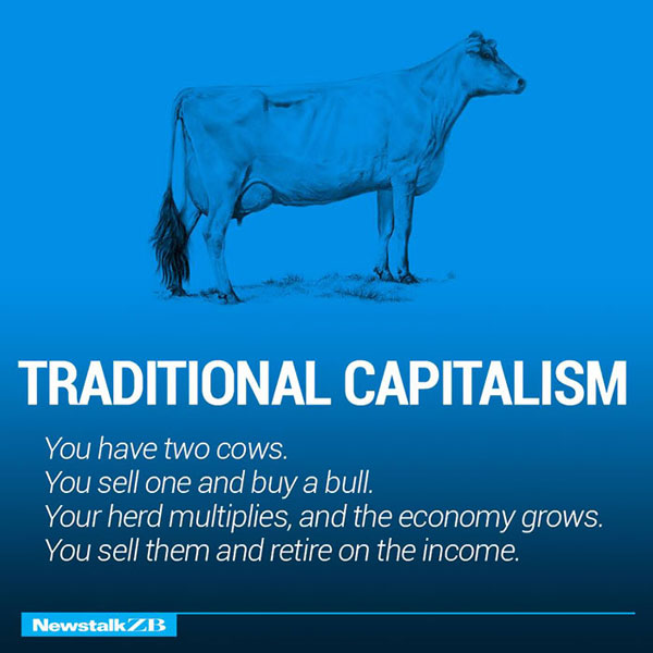
4
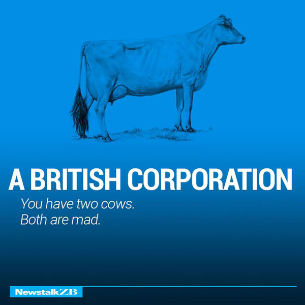
5

6

7
8
9
10
11
12

13
14

15

16

17

A fun class in ecownomics, no?
You can check more on Facebook.
You may also like Hilarious Placement Coincidences


